import matplotlib.pyplot as plt
import seaborn as sns
yield_maize = [0.895, 0.91, 0.919, 0.926, 0.929, 0.931]
plt.plot(yield_maize)
plt.show()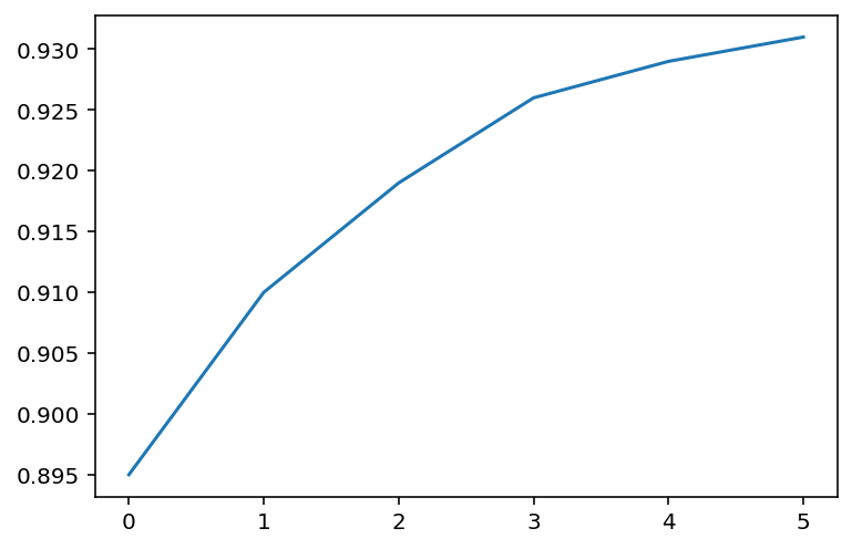
We explore how to do various visualizations using the matplolib and seaborn libraries in Python.
We shall learn the following in this tutorial:
To decide which software to use between R and Python for data visualization you can watch this video.
The first step is to install and import the libraries matplolib.pylot module that is used for basic plots like line and bar charts. It is often imported with the alias plt.
We shall use the seaborn module for more advanced plots that is imported as sns
To install use
!pip install seabornon the Jupyter Notebook Environment.
To call the module to the environment use
import matplotlib.pyplot as plt
import seaborn as sns
%matplotlib inline
The purpose of the command %matplotlib inline is to ensure that the plots are shown and embedded within the Jupyter Notebook Itself.
Without the command the plots may sometimes show in pop-up windows.
import matplotlib.pyplot as plt
import seaborn as sns
yield_maize = [0.895, 0.91, 0.919, 0.926, 0.929, 0.931]
plt.plot(yield_maize)
plt.show()
We can add the year in the x-axis and have
year = [2021,2022,2023,2024,2025,2026]
yield_maize = [0.895, 0.91, 0.919, 0.926, 0.929, 0.931]
plt.plot(year,yield_maize)
plt.show()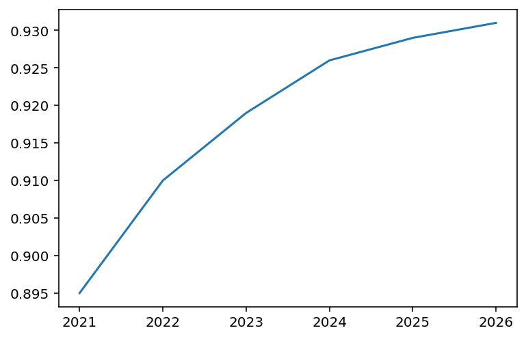
plt.plot(year, yield_maize)
plt.xlabel("Year")
plt.ylabel("Yield")
plt.title("Yield Harvest per year")
Text(0.5, 1.0, 'Yield Harvest per year')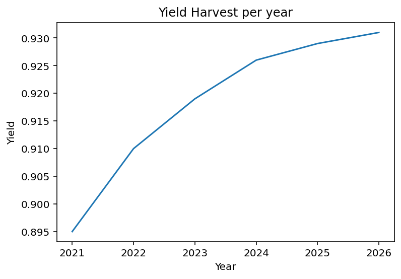
For line graphs, you can have markers for the line you are plotting. See full details of line markers in matplotlib
plt.plot(year, yield_maize, marker = "o")
plt.xlabel("Year")
plt.ylabel("Yield")
plt.title("Yield Harvest per year")
Text(0.5, 1.0, 'Yield Harvest per year')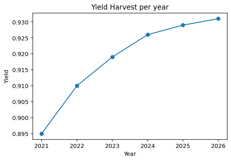
The function plt.plot supports many arguments for styling markers and the lines
color or c This sets the line colorls Gives you to choose between solid or dashed linelw sets the line widthTo see more details of the function see the documentation
To make your chart more appeasing you use some default styles form Seaborn library.
sns.set_style("whitegrid")
plt.plot(year, yield_maize, marker = "o")
plt.xlabel("Year")
plt.ylabel("Yield")
plt.title("Yield Harvest per year")
Text(0.5, 1.0, 'Yield Harvest per year')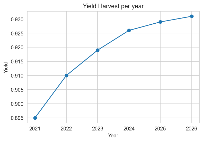
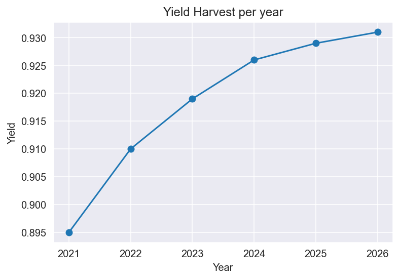
sns.set_style("darkgrid")
plt.plot(year, yield_maize, marker = "o")
plt.xlabel("Year")
plt.ylabel("Yield")
plt.title("Yield Harvest per year")
Text(0.5, 1.0, 'Yield Harvest per year')